Saturday, 17 December 2011

Friday, 16 December 2011
Thursday, 15 December 2011
Audience Profile
My audience are very affluent, with a disposable income fitting in to the ABC1 category on the jicnar scale.
My audience also has a similar taste in films as they do music. They enjoy a decent new action/thriller, however they do enjoy watching older films like the Godfather and James Bond.
My audience also like to keep in good health. Always eating breakfast, regular snacks of fruit and vegetables, with a healthy meal at the end of the day.
My audience likes to keep up with the fashion scene, spending a reasonable amount of money on their look.
My audience does not have children, but does have a partner that they like to spoil with fine wines and jewellery.
Music does not take over their life, however it is a passion that they hold deeply and they could not go a day without listening to their classic records and recent discoveries.
Friday, 9 December 2011
Performers and Casting - Models
 Charlie would be perfect as a model for the front page or double page spread of my magazine. He has a vespa, so taking a picture of him riding it would create the needed effect for him to look like a pop-rock idol.
 Jack would also be a good model because of his style and general look which conveys 60’s rock bands (Beatles) which will be featuring in my magazine. I would like to put him either on the double page spread or the contents.
 Jess is another model who would be perfect to go on to my double page spread as she has the same look as a madonnaesque singer.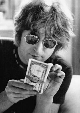
 Dom would be a perfect front page model as I think that he has a John Lennon type look about him.
 Jake and Rach also have potential to fit in to the 60’s look, I would like to feature them on my contents page or double page spread.
Monday, 5 December 2011
Researching Music Magazines

This copy of MOJO uses a picture of The Beatles as their CVI, with the name of the magazine behind the picture in white so it stands out. The photo of The Beatles gives the reader an idea of what will be inside the issue, then the 'Their 101 greatest songs' anchors the reason for them being on the front page.
MOJO is aimed at music lovers, mainly between the ages of 30 - 50, however due to its content the target audience is debatable depending on the artist featured in individual issues.

The masthead of MOJO is always at the top of the magazine in bold, clear lettering covering the top of the page. In this issue it is in white, contrasting against the black/scenery making it stand out and capture the readers attention. The selling line of MOJO is 'The Music Magazine' informing the audience immediately as it is written over the masthead.
 The cover lines are written in a bold font and part of the same colour scheme of white and grey making it easy to read. The cover lines out line some of the main content in the magazine capturing the target audiences attention due to the visual attraction, this then interests them in the contents.
Double page spreads in MOJO
- Headings are in bold, capital letters covering the top of both pages. - Main text and quotes are larger than any other texts, sometimes including first letters of articles.
- Simple colour schemes - keeping colours to a minimum
- Quotes are sometimes used in the headline/title on the picture stand first or to break up the text.
- One picture covers on page or bleeds between two, not often more than two.
- Includes journalists name
- Headlines draw in the reader but dont tell them what its about - interests them in the article
- Laid out in 2 -4 columns
Q magazine is infamous for its exclusives and interviews with the worlds biggest bands. The Lennon 70th Birthday edition is among the most famous.
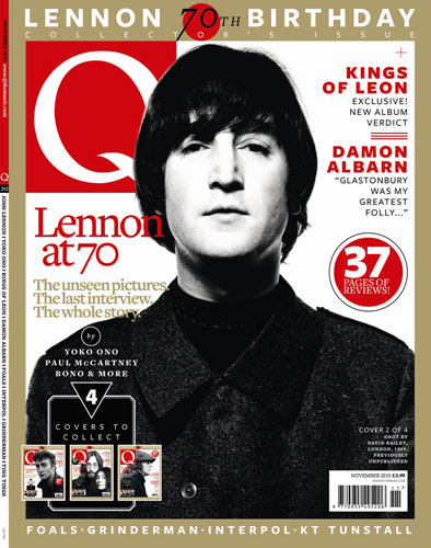 Q have used a close up of John Lennon in black and white as the CVI. He is in the centre of the page, with a light brown/gold border around the page, enhancing the visual importance of the CVI. The colour scheme used is simple, black, white, red and gold. The headlines are all in bold red lettering, excluding the main cover line 'Lennon at 70' which has been written using a serif font, which is effective because it stands out against the rest of the cover lines as it is on the left of the page.
The mast head 'Q' in white surrounded by a red box stands out behind Lennon's head because it is such a contrast of colour.

The cover lines 'Kings Of Leon' and 'Damon Albarn' also capture the readers interest and attention as it shows that the whole magazine is not dedicated to Lennon. This then increases the target audience for this particular issue as it would be on one hand increased due to the fact that John Lennon is one of the most famous, iconic singers in history. On the other hand, people who usually buy Q who are not interested in an issue in tribute to Lennon's music are also catered for, which is made obvious by the bold red lettering of the cover lines on the right side.

The Q contents page is very well laid out in to two columns, with a large picture covering the whole right hand side of the page and a smaller one which is in the first column in the top left. This ensures that the page is not plastered in pictures and is informative about what is in the magazine.
The colour scheme relates to the magazines main colours, red, black and white. The consistence of the colour scheme throughout the magazine gives it a professional look and is individual to Q.
 The text is all in sans serif, which also exudes consistency, using black for the page numbers and the majority of the text and red for the banners, underlining and to describe the main article.
The main image of the band that will be featuring in the magazine. The page number is also written in the left hand corner in large bold font.
The main features of the magazine are all in the left hand column, with the name of the artist/band written in bold capitals with the page number next to it. Red stripes are underneath the name and below the stripe is a brief description of what the reader should expect. This exudes professionalism.
Monday, 17 October 2011
Evaluation
In what ways does your media product use, develop or challenge forms and conventions of real media products?

 I have done research in to different magazines, looked at how they are put together, who for and why they use certain things on and in their products. I have used different ideas from existing college magazines to give me inspiration when designing and making the front cover and the contents page. The front cover has the usual features of a magazine such as a masthead, running head, call outs and a CVI. I have developed my magazine by making it more sophisticated than many existing magazines catering for the same audience, as I thought that this would widen its appeal slightly. I have also used a drop shadow on the masthead which is less noticeable, I have also used a sans serif front with all of the writing, which gives it consistency.
Who would be the target audience for your media product?
As it is a college magazine, the obvious choice of target audience would be students aged 16 - 19. My typical target audience on the jicnar scale would probably be graded around an E, this is because college would in most circumstances restrict students chances of having a well paying or full time job. The target audience would generally be aimed at aspirers, this is because college is generally full of people wanting to go on to higher education by choice.
How did you attract/address your audience?
I have used several features in order to attract and address my audience. For example, the name of the magazine 'Varsity' can be defined as a sports team representing a school or college. I think the name is effective because it can be easily related to a wide range of males playing sport and a small group of females. Also the CVI is of a young, good looking male leaning against a tree whith his arm resting on his head looking away from the camera. This attracts the female target audience for obvious reasons, and also males as it connotes intelligence, high fashion and popularity. The colour scheme of the front cover is black, white and grey. This allows the magazine to have a higher market appeal, but including the cover lines and tag lines such as 'Halloween Scares', 'How to pass your driving test' and 'Chrimbo Clubbing Destinations' it makes the magazine way more accessible for a younger audience. The colour scheme also makes it easy to read above the CVI, but also makes sure that there are no tacky colours involved.
 What've you learnt about other technologies from the process of constructing this product?
 When creating this media product I used two programmes, Indesign and Photoshop, and I also learnt how to use a digital SLR camera. When using the camera I learnt how to take close up and mid close up shots, how to turn the flash on and off, how to zoom and how to make the photo of a higher quality. For the magazine specification, I had to use a mid close up photo for my front cover photo, once I had taken the photo it was uploaded to Photoshop in which I learnt how to make the photo 'flawless'. I used a tool in which I could take away blemishes and certain imperfections, this improved the look of the magazine drastically. I found Photoshop fairly easy to use as I have had some past experience with it, and I thought that the finished product wouldn't have been half as good without its use.
 For the contents page, we changed programme. Indesign allowed me to introduce columns in to my contents, I could also layer text against coloured backgrounds. An example of this is the word 'Contents' on the right hand side of my contents page. It has been placed in the far right column and it is aligned with the actual contents below it. I learnt how to use swatches and change the gradient of colour. An example of this is the background colour on my contents, it is grey and black but fades in to eachother, this has been done through the use of gradient. I found Indesign alot harder to use than Photoshop and thought that the steps involved to create the piece of work were long winded and complicated.

 I have done research in to different magazines, looked at how they are put together, who for and why they use certain things on and in their products. I have used different ideas from existing college magazines to give me inspiration when designing and making the front cover and the contents page. The front cover has the usual features of a magazine such as a masthead, running head, call outs and a CVI. I have developed my magazine by making it more sophisticated than many existing magazines catering for the same audience, as I thought that this would widen its appeal slightly. I have also used a drop shadow on the masthead which is less noticeable, I have also used a sans serif front with all of the writing, which gives it consistency.
 Who would be the target audience for your media product?
As it is a college magazine, the obvious choice of target audience would be students aged 16 - 19. My typical target audience on the jicnar scale would probably be graded around an E, this is because college would in most circumstances restrict students chances of having a well paying or full time job. The target audience would generally be aimed at aspirers, this is because college is generally full of people wanting to go on to higher education by choice.
How did you attract/address your audience?
I have used several features in order to attract and address my audience. For example, the name of the magazine 'Varsity' can be defined as a sports team representing a school or college. I think the name is effective because it can be easily related to a wide range of males playing sport and a small group of females. Also the CVI is of a young, good looking male leaning against a tree whith his arm resting on his head looking away from the camera. This attracts the female target audience for obvious reasons, and also males as it connotes intelligence, high fashion and popularity. The colour scheme of the front cover is black, white and grey. This allows the magazine to have a higher market appeal, but including the cover lines and tag lines such as 'Halloween Scares', 'How to pass your driving test' and 'Chrimbo Clubbing Destinations' it makes the magazine way more accessible for a younger audience. The colour scheme also makes it easy to read above the CVI, but also makes sure that there are no tacky colours involved.
 What've you learnt about other technologies from the process of constructing this product?
 When creating this media product I used two programmes, Indesign and Photoshop, and I also learnt how to use a digital SLR camera. When using the camera I learnt how to take close up and mid close up shots, how to turn the flash on and off, how to zoom and how to make the photo of a higher quality. For the magazine specification, I had to use a mid close up photo for my front cover photo, once I had taken the photo it was uploaded to Photoshop in which I learnt how to make the photo 'flawless'. I used a tool in which I could take away blemishes and certain imperfections, this improved the look of the magazine drastically. I found Photoshop fairly easy to use as I have had some past experience with it, and I thought that the finished product wouldn't have been half as good without its use.

Subscribe to:
Posts (Atom)