In what ways does your media product use, develop or challenge forms and conventions of real media products?
 The masthead on the right is from 'NME' magazine. I thought that the dark red and the white outline with a white tag line underneath had a really eye catching effect on the magazine and stood out against all CVI's.
 This is the call out box in Q magazine. It stands out with the colours and is done in all different fonts and lettering. I tried to remake this in to my own media product by using the colour themes and the spaces in between letters.
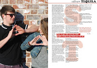
On the double page spread I covered one whole side with a picture, this is seen in many magazine double page spread and I think it is very effective and eye catching. It seems to be used in music magazines especially as they feature a photoshoot with the artist and use a full sized photo to go either across the two pages or covering one. I also used the lettering behind the text because this is also featured in Q magazine alot.


No comments:
Post a Comment